
Understanding the dashboards
The Dashboard is designed to answer four different questions:
Home: What needs my attention right now?
Leasing Trends: How has leasing performance looked over time?
Active Portfolio: How is each live unit performing right now?
Marketing & Sources: Where are my inquiries coming from, and how well do they convert?
AI Leasing Agent: How are prospects engaging with my AI Leasing Agent?
If the AI Leasing Agent is not enabled, you'll have access to a Messaging dashboard that answers the question, "How are prospects engaging with my team?"
This article explains the purpose of each page and how the main numbers are calculated in plain language.
Home
Use Home as your quick daily check-in. It is meant to help you spot problems fast, not to give a full historical report.
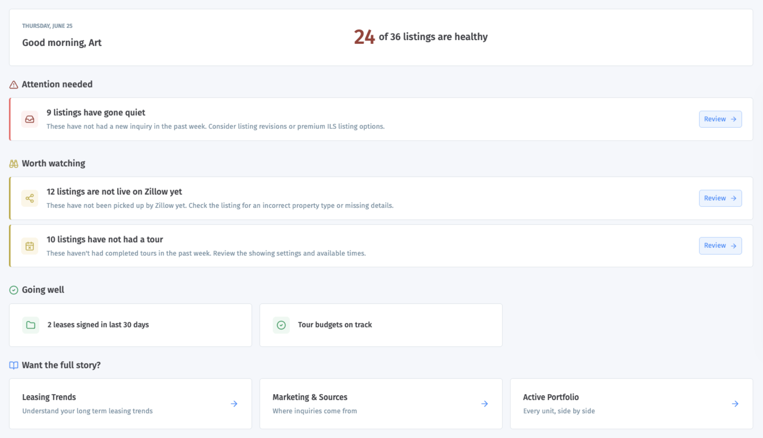
How the top health summary works
The top summary is based on your active units.
Healthy listings = active listings that are not flagged by any of the Home health checks
Flagged listings = active listings that match one or more of the checks below
One listing can appear in more than one check, but it only counts once when Showdigs decides whether that listing is healthy or flagged.
How the checks are calculated
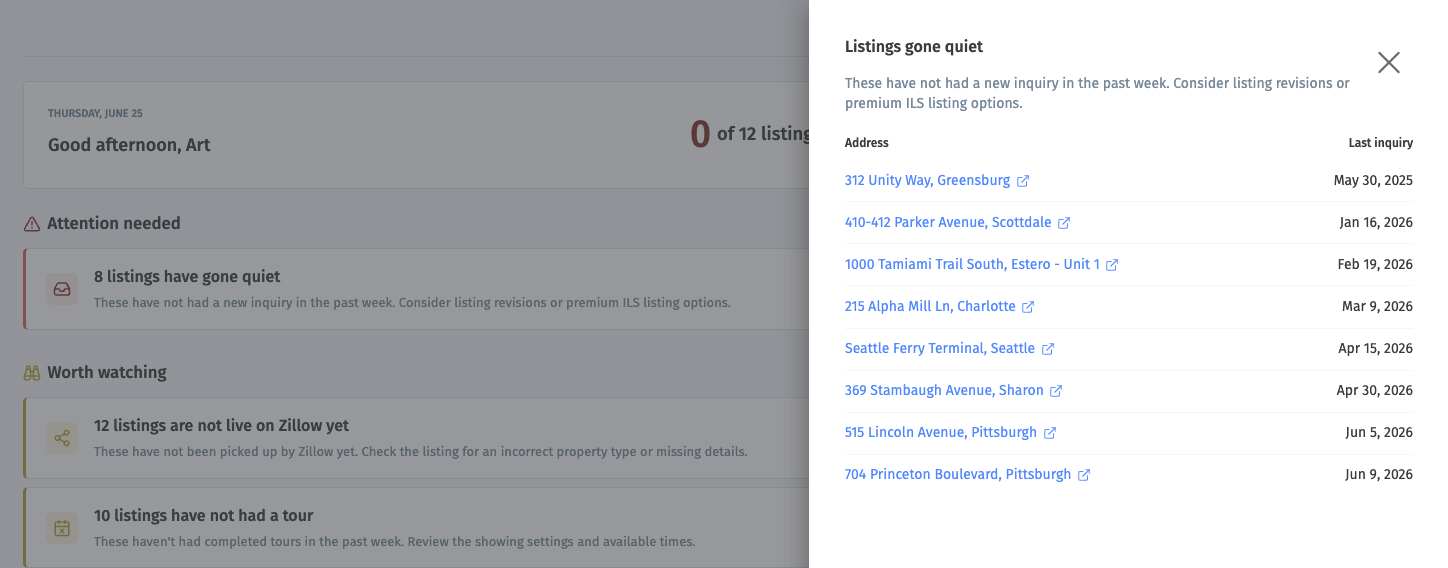
Listings gone quiet
This check flags a listing when:
the listing has been on the market for at least 7 days
it has had 0 new inquiries in the last 7 days
Listings taking longer than usual
This check compares a live listing's days on market to your recent leased average.
Days on market = days since the current lease period started
The benchmark = average days on market for units rented in the last 90 days
A listing is flagged if its current days on market is above that recent average
This check only turns on when there is enough recent leased history to make the comparison useful.
Prospect locked out
This check flags a listing when the latest tour for that unit ended in a technical or access-related issue. Make sure you verify the access instructions for future tours.
Has not had a tour
This check flags a listing when:
the listing has been available for showings for at least 7 days
it has had 0 counted tours in the last 7 days
For this check, counted tours include completed tours and certain attempted tours such as no-shows or technical issues. Brand new listings are excluded.
Not live on Zillow yet
This check appears only for businesses using syndication.
It flags a listing when:
the listing has been active for more than 24 hours
Zillow still does not show it as live
Tour budget will run over today
This check appears only when tour budgets apply to the business.
It flags a unit when today's scheduled Showdigs agent tours would exceed the remaining tour budget for that unit.
Going well
This section highlights positive signals, such as:
leases signed in the last 30 days
no units over today's tour budget
no syndication delays
What it's best for
When you want to know:
what needs action today
which listings are slowing down
whether your portfolio looks healthy overall
Leasing Trends
Use Leasing Trends to understand how your leasing performance has changed over time.
This page is historical. It is based on units that were actually rented, not just units that are active today.
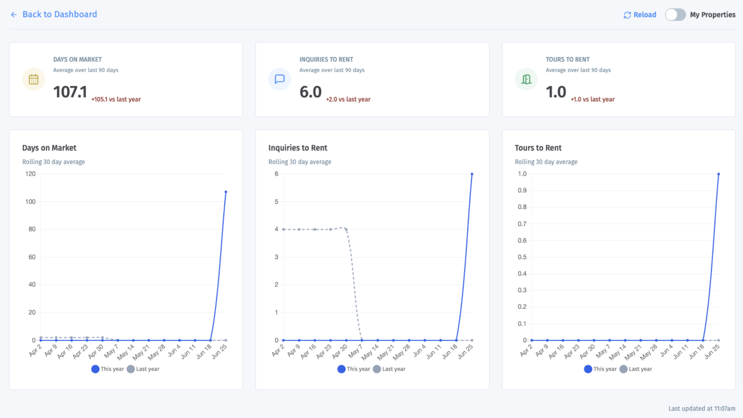
Default time frame
Summary cards: last 90 days
Trend charts: rolling 30-day averages across that 90-day period
Comparison line: same period last year, when available
How the summary cards are calculated
Days on Market
This is the average number of days it took rented units to lease in the last 90 days.
For each rented unit: days on market = days between lease period start and lease period end
Then Showdigs averages those results across all rented units in the period
Inquiries to Rent
This is the average number of inquiries it took to rent a unit in the last 90 days.
For each rented unit: count inquiries that came in during that unit's lease period
Then divide total inquiries by total leased units
Tours to Rent
This is the average number of completed tours it took to rent a unit in the last 90 days.
For each rented unit: count completed tours during that unit's lease period
Then divide total completed tours by total leased units
What the deltas mean
The change shown next to each card compares the current 90-day period to the same 90-day period last year.
How the charts are calculated
Each chart shows a rolling 30-day average:
each point looks back over the prior 30 days
the page then plots those averages over time
if last year's data exists, you will also see a comparison line
What it's best for
Use this page when you want to know:
whether units are leasing faster or slower than before
whether it is taking more or fewer inquiries to get a lease
whether tour volume is improving or declining
Marketing & Sources
Use Marketing & Sources to understand both:
where your inquiries come from
how well each source turns into scheduled and completed tours
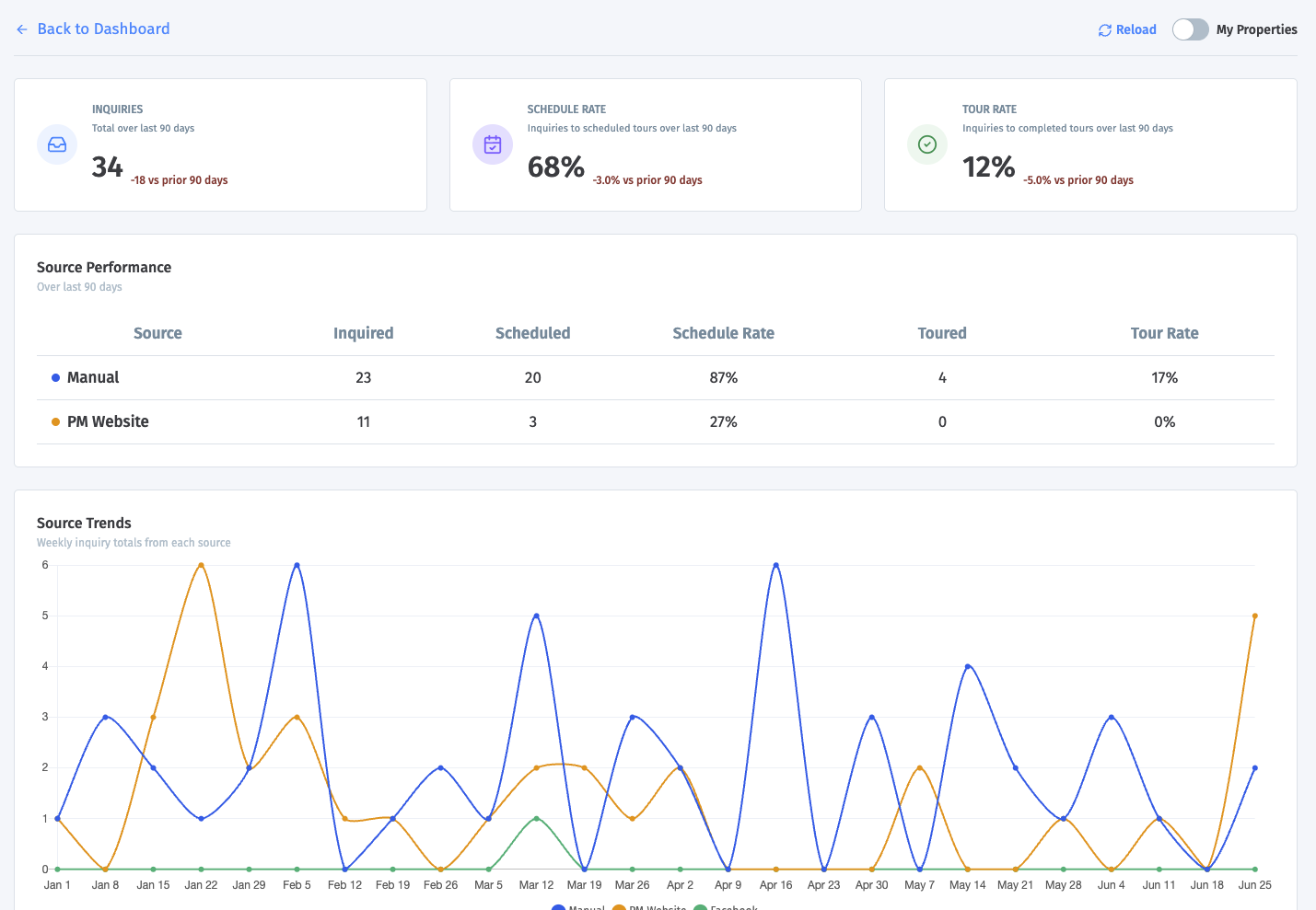
Default time frame
KPI cards: last 90 days
Source table: last 90 days
Source Trends chart: last 180 days
Timing charts: last 90 days
How the top cards are calculated
Inquiries
The total number of inquiries in the last 90 days.
The delta compares that total to the prior 90-day period.
Schedule Rate
The percent of inquiries that produced at least one scheduled tour.
Formula: inquiries with a scheduled tour / total inquiries
Tour Rate
The percent of inquiries that produced at least one completed tour.
Formula: inquiries with a completed tour / total inquiries
How the Source Performance table works
This table groups inquiries by source, such as Zillow, Apartments.com, or another source label.
For each source, Showdigs shows:
Inquired: total inquiries from that source
Scheduled: inquiries from that source that resulted in a scheduled tour
Schedule Rate: scheduled divided by inquired
Toured: inquiries from that source that resulted in a completed tour
Tour Rate: toured divided by inquired
How the Source Trends chart works
This chart shows weekly inquiry totals by source over the last 180 days.
The top sources are shown individually
Smaller sources are grouped into Other
This is useful for spotting which sources are growing, shrinking, or staying steady.
How the timing charts work
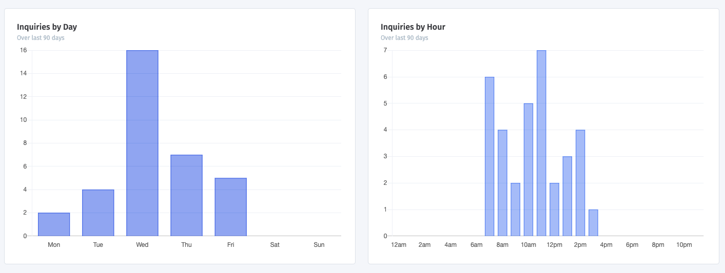
Inquiries by Day
This shows which day of the week inquiries most often come in.
Inquiries by Hour
This shows what time of day inquiries most often come in.
These charts use the property's local time zone, which makes them more useful for scheduling and follow-up planning.
How the Campaign Performance table works
This table groups inquiries by campaign. Campaigns are tracked when a prospect visits a listing using a campaign tracking link.
For each campaign, Showdigs shows:
Inquired: total inquiries from that campaign in the last 90 days
Scheduled: inquiries from that campaign that resulted in a scheduled tour
Schedule Rate: scheduled divided by inquired
Toured: inquiries from that campaign that resulted in a completed tour
Tour Rate: toured divided by inquired
What it's best for
Use this page when you want to know:
which sources bring the most leads
which sources bring the best-converting leads
when prospects are most likely to inquire
Active Portfolio
Use Active Portfolio to compare your current live units side by side. This page is about what is happening right now in your active portfolio, not about leased history.
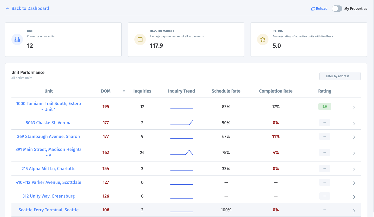
What the top cards mean
Units
The number of units that are currently active.
Days on Market
The average days on market across all active units.
For each unit: days on market = days since the current lease period started
Then Showdigs averages those values across all active units
Rating
The average survey rating across active units that have tour feedback.
For self-showings, we get a 1-5 rating from prospects that complete their survey.
For agent showings, we survey the agent not the prospect, so we translate the "Is the prospect likely to apply" into a rating: Likely to apply = 5, Maybe = 3, No = 1.
Units without ratings are not included in the rating average.
How the Unit Performance table works
Each row represents one active unit.
DOM: The unit's current days on market.
Inquiries: The number of inquiries received during that unit's current lease period.
Inquiry Trend: The unit's daily inquiry counts over the last 7 days. This is meant to show whether inquiry activity is rising, flat, or slowing down.
Schedule Rate: The percent of inquiries that led to a scheduled tour. Formula: scheduled tour inquiries / total inquiries
Completion Rate: The percent of inquiries that led to a successfully completed tour. Formula: completed tour inquiries / total inquiries
Rating: The average survey rating for completed tours tied to that unit.
What you see when you expand a unit
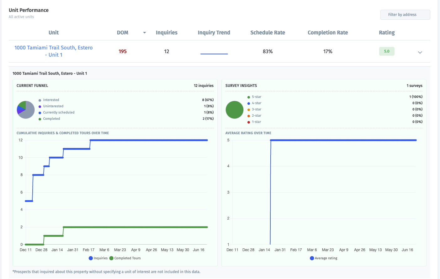
Current Funnel
This shows how that unit's inquiries are currently breaking down.
Possible groups include:
Interested: inquired, but no current scheduled tour or completed tour
Disqualified
Uninterested
Currently scheduled
Completed
Access issue
No show
Cancelled
The percentages are based on that unit's inquiry count for the current lease period.
Cumulative Inquiries & Completed Tours Over Time
This chart shows running totals over time for:
total inquiries
completed tours
It helps you see whether interest is growing faster than tours are being completed.
Survey Insights
This section shows the rating breakdown from completed-tour surveys, including the share of 1-star through 5-star ratings.
Average Rating Over Time
This chart shows how the unit's average tour rating changed over time.
Campaign Performance
This table shows campaign results for the unit’s current leasing cycle, if applicable. For each campaign, Showdigs shows:
Inquired: inquiries from that campaign during the unit’s current lease period
Scheduled: inquiries from that campaign that resulted in a scheduled tour
Schedule Rate: scheduled divided by inquired
Toured: inquiries from that campaign that resulted in a completed tour
Tour Rate: toured divided by inquired
Tour agents
This section shows how completed and attempted tours for the unit are distributed by tour assignee, such as Showdigs, self-showing, or another assigned agent.
Top Sources
This section shows the inquiry sources that produced the most inquiries for the unit during the current leasing cycle.
Important note
For the expanded unit details, prospects who inquired about a property without choosing a specific unit are not included in the charts.
What it's best for
Use this page when you want to know:
which active units need help
which units are converting well
which units are getting traffic but not getting tours
AI Leasing Agent / Messaging
If AI Leasing Agent is disabled
If the AI Leasing Agent is not enabled, this dashboard still helps you understand prospect messaging activity. Instead of showing AI-handled conversations, Showdigs shows messaging activity and property manager response time.
For businesses without AI enabled, the summary cards include:
Prospects Assisted: prospects who reached out for help during the current period
Prospects Converted: prospects who scheduled a tour after receiving help
Response Time: the average time between a prospect message and a property manager reply
The charts still show recent communication patterns, including SMS received, SMS sent, calls received, call duration, and when prospects most often ask questions.
If AI Leasing Agent is enabled
Use AI Leasing Agent to understand how prospects are engaging with your AI assistant.
This page is based on recent prospect communication with the AI Leasing Agent, including SMS activity, calls, and questions from prospects.
Default time frame
Summary cards: last 30 days
Daily activity chart: last 30 days
Call duration chart: last 30 days
Question timing charts: last 30 days
How the summary cards are calculated
Prospects Assisted
The number of prospects who reached out for help and were assisted by the AI Leasing Agent during the current period.
The delta compares that total to the prior period.
Prospects Converted
The number of prospects who scheduled a tour after receiving help from the AI Leasing Agent.
The delta compares that total to the prior period.
AI Resolved Conversations
The percent of conversations handled entirely by the AI Leasing Agent without a property manager handoff.
How the charts are calculated
Daily activity trend
This chart shows daily communication activity, including:
SMS Received
SMS Sent
Calls Received
Call Duration
This chart shows the total number of minutes spent on calls each day.
Questions by day of week
This chart shows when prospects most often ask questions, grouped by day of week.
Questions by time of day
This chart shows when prospects most often ask questions, grouped by time of day.
These timing charts help show when prospects are most likely to need help from the AI Leasing Agent.